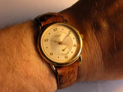
 This is a picture of the Breil, a recent one. The band is different from the original one, which I was never really able to find again. The crown has also been replaced, as the original was very much worn, and it's not the best replacement, since the original was better rounded, while this one would have been better on a more business-like watch. However, it is in the original size, which is better than having some monster crown that would've been entirely out of place. This was done sometime in the late 1980s in Washington, DC.
It's an unusual watch for a quartz: decentral second hand, fixed band lugs (that's right, the watch band is glued into place, meaning it's both expensive and reltivaly hard to find) and it's a fairly small watch, around 33mm.
But it's quite a homage to classic manual wind Swiss watches of the 1950s and before. Just like many watches of these days, the lume is non-existent. But look at the dimensions of the watch and its design: there's a lot of harmony on the face of the watch. The hour hand is clearly shorter than the minute hand; the pointer doesn't quite reach the inner circle. The numbers - 12, 2, 4, 6, 8, 10 - are in raised gold with angles cut into the letters to maximize their legibility, using reflection to capture light. The minute hand reaches exactly the middle of the dot at 1, 3, 5, 7, 9 and 11, adding to the harmonic dimensions of the watch.
What sorta kinda ruins the face is the name of the model (Bartholemy) in the cursive script at the bottom of the decentral second hand. On the top third of the watch face you have a strong serif font for the company name and the movement, nicely spaced; the writing of the model name is in some sort of silly cursive font. If they had avoided this completely, putting the model name on the back of the watch, then it'd be okay. As is, it always annoyed me, deep down inside, as being out of place with the rest of the watch face.


No comments:
Post a Comment